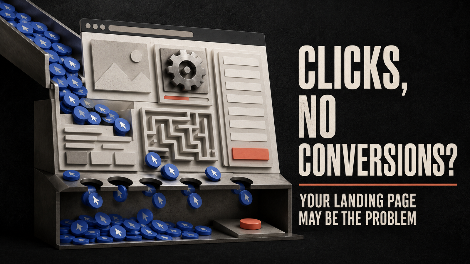

Your advertising campaign is generating traffic.
People are seeing the advertisement, clicking it and arriving on the website. The click-through rate looks healthy, and the cost per click appears manageable.
But the leads or sales are not coming.
The immediate reaction is often to blame the advertising platform. Marketers change the audience, increase the budget, replace the creative or adjust the campaign objective.
Sometimes the campaign is the problem. But when advertisements consistently generate relevant clicks without conversions, the landing page deserves equal attention.
An advertisement creates interest. The landing page must turn that interest into action.
If the page is slow, confusing, untrustworthy or disconnected from the advertisement, even highly interested visitors may leave without enquiring or purchasing.
Landing page optimization is the process of improving this experience so that a greater percentage of visitors complete the desired action.
What Is Landing Page Optimization?
Landing page optimization is the process of improving a webpage to increase the percentage of visitors who complete a specific conversion.
The conversion may be:
- Submitting a lead form
- Purchasing a product
- Booking an appointment
- Requesting a quotation
- Starting a free trial
- Calling a business
- Sending a WhatsApp message
- Downloading a guide
- Registering for an event
- Subscribing to a newsletter
Optimization involves more than changing colours or rewriting a button.
A high-converting landing page aligns several elements:
- Visitor intent
- Advertising message
- Offer
- Page copy
- Visual hierarchy
- User experience
- Trust
- Page speed
- Form design
- Conversion tracking
The goal is to remove uncertainty and make the next action feel clear, relevant and worthwhile.
How to Calculate Landing Page Conversion Rate
The landing page conversion rate shows the percentage of visitors who complete the desired action.
The formula is:
Conversion Rate = (Number of Conversions ÷ Number of Visitors) × 100
If 1,000 people visit a page and 40 submit the form, the conversion rate is 4%.
This figure becomes meaningful only when the conversion is defined correctly.
A submitted form is not necessarily a qualified lead. A lead is not necessarily a sale. Businesses should track the complete journey when possible:
- Landing page visit
- Form submission
- Valid lead
- Qualified lead
- Appointment or proposal
- Sale
- Revenue
Optimizing only for form submissions can result in more leads but lower lead quality.
Why People Click Ads but Do Not Convert
A click confirms that the advertisement created enough interest for someone to visit the page.
It does not confirm that the person was fully convinced.
Several problems can occur between the click and the conversion.
The Advertisement Creates the Wrong Expectation
An advertisement might promise a free consultation, but the landing page immediately asks for payment.
A product advertisement may highlight a discount that is difficult to find on the website. A clinic advertisement may promote one treatment but send visitors to a general homepage.
The user feels that the page does not match what they clicked.
The Page Loads Too Slowly
Every additional delay gives the visitor another opportunity to leave.
Large images, unnecessary scripts, video files, poorly configured hosting and excessive tracking tags can slow down a landing page.
Mobile users may experience even greater delays on weaker networks.
The Offer Is Not Clear
Visitors should quickly understand:
- What is being offered
- Who it is for
- What problem it solves
- What it costs or requires
- Why they should trust the business
- What they should do next
If this information is hidden behind vague headlines and decorative copy, the visitor must work too hard to understand the page.
The Page Asks for Too Much
A long form can feel like a commitment.
If a business asks for name, email, phone number, company name, address, budget, designation and several written answers before providing any value, visitors may abandon the page.
Every field should have a clear purpose.
The Page Does Not Feel Trustworthy
Visitors may hesitate if the page contains:
- Broken links
- Poor grammar
- Low-quality design
- Unclear pricing
- Unrealistic claims
- Missing contact details
- No privacy information
- Generic testimonials
- Unfamiliar payment methods
- Inconsistent branding
Trust is especially important in healthcare, finance, education, professional services and high-value purchases.
The Mobile Experience Is Weak
A landing page may look excellent on a laptop and become nearly unusable on a phone.
Buttons may be too small, text may require zooming, forms may extend beyond the screen and pop-ups may cover the main content.
If most advertisement traffic comes from mobile devices, the mobile page is the primary experience—not a secondary version.
The Call to Action Is Confusing
A visitor should not have to decide between several unrelated actions.
If the page asks users to call, subscribe, read the blog, view services, follow social accounts and request a quotation, attention becomes divided.
A landing page usually performs better when it has one primary conversion goal.
1. Improve Message Match
Message match means maintaining a clear connection between the advertisement and the landing page.
The visitor should immediately recognise that they have arrived at the correct place.
If the advertisement says:
“Get a Free Solar Savings Assessment”
The landing page headline should continue the same promise. It should not say:
“Welcome to Our Renewable Energy Company”
The first headline is specific and connected to the user’s reason for clicking. The second is generic.
Strong message match includes:
- The same offer
- Similar language
- Consistent imagery
- The advertised service
- The relevant location
- The same audience
- The correct price or discount
- A matching call to action
Different campaigns may require different landing pages.
Sending every advertisement to one general website homepage often weakens relevance.
2. Make the Headline Specific
The headline should answer the visitor’s most important question: “What is this page offering me?”
A weak headline describes the business.
A stronger headline describes the outcome or opportunity for the customer.
Weak:
“Professional Digital Marketing Solutions”
Stronger:
“Generate Qualified Solar Installation Enquiries With Targeted Paid Campaigns”
The stronger version communicates the audience, service and expected outcome.
A useful landing page headline normally includes at least one of the following:
- A specific outcome
- A clear problem
- A defined audience
- A valuable offer
- A meaningful differentiator
The headline should be accurate. Strong copy does not require exaggerated guarantees or unverified claims.
3. Clarify the Value Proposition
The value proposition explains why the visitor should choose this offer over other available options.
It should communicate:
- The problem being solved
- The expected benefit
- The process
- What makes the offer different
- The effort required from the customer
A good value proposition is not simply “We provide high-quality service.”
Almost every business claims quality.
A stronger value proposition explains what the customer receives and why the method is relevant.
4. Use One Primary Call to Action
The call to action tells visitors what to do next.
Examples include:
- Book Your Consultation
- Request a Quote
- Check Availability
- Start Your Free Trial
- Get the Treatment Plan
- Download the Guide
- Speak With Our Team
Avoid vague buttons such as “Submit” or “Click Here” when a more specific phrase is possible.
The primary call to action should appear:
- Near the top of the page
- After important benefits
- Near proof or testimonials
- At the bottom of the page
Repeating the same primary action is different from presenting several competing actions.
5. Reduce Form Friction
The ideal form is not always the shortest form. It is the shortest form that collects the information required for the next step.
For a basic enquiry, the business may only need:
- Name
- Phone number
- Email address
- Required service
Additional qualification questions can improve lead quality, but they may reduce the number of submissions.
The right balance depends on the campaign objective.
For expensive services, asking one or two relevant questions can help filter weak enquiries. For a low-commitment download, a long form is usually unnecessary.
Forms should also:
- Use clear field labels
- Show error messages beside the relevant field
- Accept common phone-number formats
- Avoid resetting after an error
- Work properly on mobile devices
- Explain what happens after submission
- Include appropriate privacy information
6. Strengthen Trust
Visitors are being asked to provide money, time or personal information.
The page should reduce the perceived risk.
Useful trust elements may include:
- Genuine customer testimonials
- Relevant case studies
- Professional credentials
- Clear contact information
- A physical address when relevant
- Transparent pricing or process
- Secure payment indicators
- Recognised certifications
- Real photographs
- Privacy and refund information
- Answers to common objections
Trust elements must be genuine.
Invented testimonials, false urgency and logos of companies that are not customers may temporarily improve appearance but create serious ethical and reputational risks.
7. Improve Page Speed
Landing page speed affects both user experience and campaign efficiency.
Large creative files are a common problem. The page may contain a high-resolution banner that is displayed at a fraction of its original size.
Practical improvements include:
- Compressing images
- Using modern image formats
- Loading images at appropriate dimensions
- Removing unnecessary scripts
- Reducing third-party widgets
- Limiting custom font files
- Deferring non-essential content
- Using efficient hosting
- Caching static resources
- Testing the page on mobile networks
Do not judge performance only from a fast office internet connection.
Test the page on a normal smartphone and a realistic mobile connection.
8. Design for Mobile First
A mobile landing page should be easy to understand and complete using one hand.
Review:
- Font size
- Button height
- Spacing between fields
- Sticky call-to-action placement
- Form keyboard types
- Image cropping
- Pop-up behaviour
- Navigation
- Page length
- Tap targets
- Payment flow
A mobile visitor should not need to zoom, rotate the device or repeatedly correct form fields.
Clickable phone and WhatsApp actions should open the correct application and carry the expected context.
9. Remove Distractions
A normal website helps visitors explore. A landing page helps visitors complete one action.
Unnecessary navigation links can pull traffic away from the conversion path.
Depending on the campaign, consider reducing:
- Full website navigation
- Unrelated service links
- Blog links
- Social-media icons
- Multiple promotional banners
- Competing pop-ups
- Automatic videos
- Excessive animations
The visitor should still be able to access essential legal, privacy and contact information.
The purpose is not to trap visitors. It is to maintain focus.
10. Show the Offer Visually
Relevant visuals can make an offer easier to understand.
An e-commerce page should clearly show the product. A clinic page may show the treatment environment or explain the procedure. A software page can demonstrate the interface.
Avoid unrelated stock photography that adds decoration without information.
Useful visuals may include:
- Product photographs
- Service demonstrations
- Before-and-after examples where appropriate and truthful
- Process illustrations
- Interface previews
- Short videos
- Comparison tables
- Original team or location photographs
Visuals should support the decision, not compete with the call to action.
11. Address Objections
Visitors may want the offer but still have concerns.
Common objections include:
- Is it expensive?
- How long will it take?
- Is this business legitimate?
- Will this work for my situation?
- What happens after I enquire?
- Is there a contract?
- Can I cancel?
- Is my information safe?
A strong page answers these concerns before the visitor needs to ask.
Frequently asked questions, process sections, guarantees and transparent terms can reduce uncertainty.
Do not create guarantees the business cannot honour.
12. Match the Page to Visitor Intent
Not every visitor is ready to purchase.
Someone searching “what is laser hair removal” may be researching. Someone searching “book laser hair removal near me” is closer to action.
The landing page should match the stage of awareness.
For high-intent traffic, the page can focus on booking, price, location and availability.
For early-stage traffic, the page may need more education, comparisons and trust-building before asking for a consultation.
One landing page cannot perfectly serve every keyword, advertisement and audience.
13. Review Traffic Quality
A landing page cannot convert visitors who were never relevant.
If optimization produces little improvement, examine the traffic source.
Ask:
- Does the advertisement clearly describe the offer?
- Are broad keywords attracting unrelated searches?
- Is the audience located in the service area?
- Are placements generating accidental clicks?
- Does the campaign target customers or job seekers?
- Is the price realistic for the audience?
- Does the creative create misleading curiosity?
Landing-page optimization and campaign optimization must work together.
14. Verify Conversion Tracking
Sometimes the page is converting, but the tracking is broken.
Test the complete journey manually:
- Click the advertisement or test campaign URL.
- Load the landing page.
- Submit the form.
- Confirm that the user sees the correct thank-you state.
- Check whether the lead reaches the CRM or email inbox.
- Verify that the analytics event fires once.
- Confirm that the advertising platform receives the event.
- Test calls and messaging links.
- Test purchases and payment confirmation.
- Check mobile and desktop separately.
Duplicated or missing events can produce incorrect optimization decisions.
15. Run Controlled A/B Tests
An A/B test compares two versions of a page.
Version A may use the current headline. Version B may use a more specific value proposition.
Traffic is divided between the versions, and performance is compared.
Useful elements to test include:
- Headline
- Offer
- Form length
- Call-to-action copy
- Page structure
- Hero image
- Social proof
- Pricing presentation
- Appointment method
Change one major variable at a time when possible. If every element changes, it becomes difficult to understand what caused the result.
Allow enough traffic and conversions before making a decision. A temporary difference based on a small number of visitors may disappear as more data is collected.
A Practical Landing Page Optimization Checklist
Before sending paid traffic to a page, confirm the following:
Message
- The headline matches the advertisement.
- The offer is immediately clear.
- The target audience can recognise itself.
- The benefits are specific and believable.
User Experience
- The page loads reliably.
- The mobile version is easy to use.
- The primary call to action is obvious.
- Navigation and distractions are limited.
Form
- Only necessary fields are required.
- Error messages are clear.
- The form works on common devices.
- The next step is explained.
Trust
- Testimonials and claims are genuine.
- Contact information is visible.
- Privacy information is available.
- Objections are addressed.
Tracking
- Conversion events fire correctly.
- Leads reach the CRM.
- Calls and messaging actions are measured.
- Duplicate submissions are identified.
- Qualified leads and sales are recorded.
Frequently Asked Questions About Landing Page Optimization
What is landing page optimization?
Landing page optimization is the process of improving a page so that more visitors complete its intended conversion action.
Why do my ads get clicks but no conversions?
Possible causes include weak traffic quality, slow loading, poor message match, unclear offers, long forms, low trust, bad mobile design or broken tracking.
Should paid ads go to the homepage?
Usually, a dedicated landing page provides stronger message match and a more focused conversion path. A homepage may work when it is already closely aligned with the campaign.
How long should a landing page be?
It should be long enough to answer the visitor’s important questions. A simple offer may need a short page, while an expensive or unfamiliar service may require more explanation.
What is a good landing page conversion rate?
There is no universal rate. Performance depends on the industry, offer, traffic quality, device, conversion difficulty and lead-quality requirements.
Should I remove website navigation from a landing page?
Removing or reducing navigation can help maintain focus. Essential privacy, legal and contact information should remain accessible.
What should I test first?
Begin with major factors such as the offer, headline, message match, form and call to action before testing small design details.
Can a landing page improve lead quality?
Yes. Clear pricing, eligibility information and relevant qualification questions can discourage unsuitable enquiries while guiding stronger prospects.
Final Thoughts
Advertising cannot compensate for a landing page that fails to continue the conversation.
The advertisement earns attention and creates an expectation. The landing page must confirm that expectation, explain the offer, build trust and make the next step easy.
When clicks are arriving without conversions, avoid changing the campaign blindly.
Review the complete path:
- Who is clicking?
- What did the advertisement promise?
- What does the visitor see first?
- Does the page load properly?
- Is the offer clear?
- Is the form reasonable?
- Does the business appear trustworthy?
- Is tracking working?
- Are the leads being followed up?
The best campaign is not the one that generates the cheapest click. It is the one that brings the right visitor to a page capable of turning genuine interest into measurable business results.